The skill to analyse photos – let it be your own one’s or those that inspire and animate you the most – is a very good base to understand how and why photos ‘look good’. Why some photos are just so much more pleasing to the eye and why that is the case.
Once you’re not only able to tell THAT a food photo is well done but also WHY and how the photographer achieved this awesomeness, you can use that newfound knowledge for your own work.
If you understand the basic principles of composition and recognize it in other photos you can make use of it or even break those rules deliberately.
The question if a photo is ‘good’ or ‘bad’ is of course a very subjective and biased one. However, there are certain aspects that will higher your chances of creating a visually pleasing food photo. And there is also no denying that there are certain photos out there, that are fancied by a strikingly high number of people. Or maybe there’s a certain photographer who’s pictures delight you big time and which have an outstanding, unique style. In this case it’s definitely worthwhile to take a closer look. Why are those photos so extraordinary?
Most of the time the creators of these images have done the same things ‘right’. There are simply some design basics, let it be composition, styling or a skilled use of light, that will make a photo a ‘good one’. Naturally, technology is not everything – but a good and basic knowledge of technical and design essentials will make it easier for you to realise your creative ideas and concepts.
It’s those fundamentals that we want to learn and the easiest way to achieve that is by observing and imitating.
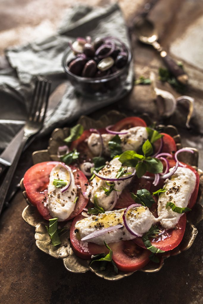
So, when I’m analysing a photo like this rustic shot of tomato and (vegan) mozzarella I tend to focus on three aspects that are important (to me) for a good food photo:
LIGHT, COMPOSITION & STYLING
Let’s focus on the light first.
Even without knowing what kind of light – artificial or natural light – you can make some educated guesses by observing the quality of the light, the direction where it comes from and the shadows it is causing.
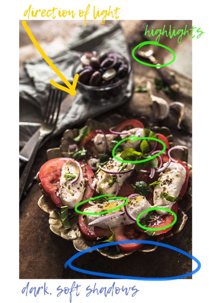
In this shot we have a backlight from the right corner which causes beautifully soft shadows which probably weren’t lightened with a reflector since the area in front of the plate is extremely dark. All this tells us that the light either comes from a rather big softbox or from indirect sunlight on a cloudy day or which was diffused with a light curtain or the like.
The use of backlight does not only create a gloomy, moody atmosphere but also adds very beautiful reflexes on the mozzarella and highlights the glossy consistency of the oil drizzled on top. It furthermore shines through the herbal leaves drizzled over the dish and makes them look fresh and radiant. Have you noticed the highlighted areas on the cutlery and garlic cloves in the background?
Awww, light is such a wonderful tool to highlight areas and enhance structures.
Compositional decisions are meant to guide the view through a photo towards the important areas. This can be achieved in all different kind of ways →
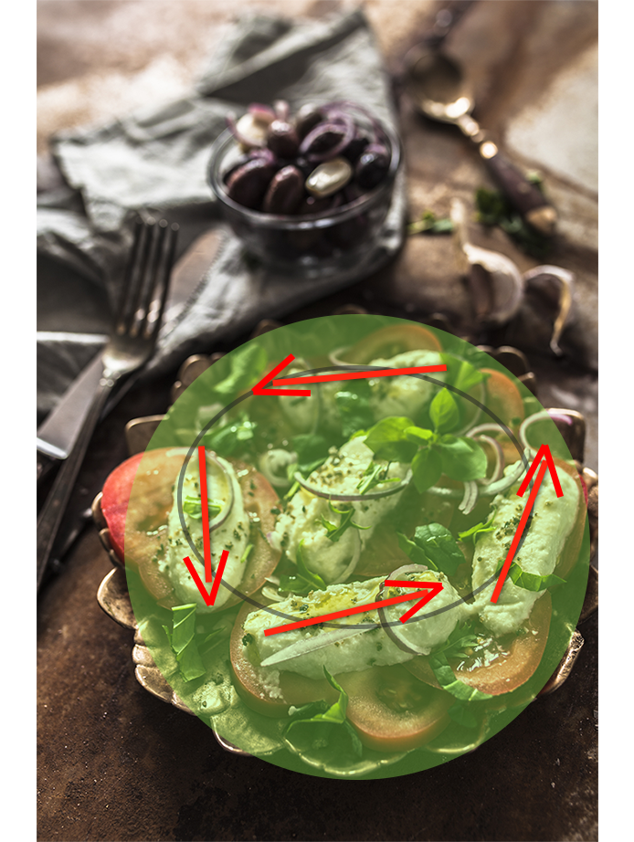
The scene is cropped very tightly. The main subject – the plate with tomato and mozzarella cheese – is placed off center, yet very prominently and was cropped a little on the right. It takes up about 40% of the space in the picture. The mozzarella pieces are forming a circle and thus, instead of guiding the view away from the center, keep your eyes locked to the plate.
Our eyes are unconsciously always searching for the most contrasty (= sharpest) areas in a photo. In our case study the focus lies on the first piece of mozzarella. The sharpness rapidly decreases in front of and behind it and thus makes it quite easy for the eye to keep going back to this single area of crisp sharpness again and again.
This photo was shot with a 35mm focal distance at an angle of approximately 45°. The angle (combined with a very open aperture) results in a very low depth of field which creates a beautiful blur in the background (contrary to shots from a top view). The relatively short focal length and the closeness to the subject causes closer objects to appear very big and objects further afar to appear much smaller. The plate in the foreground therefore appears quite big and prominent.
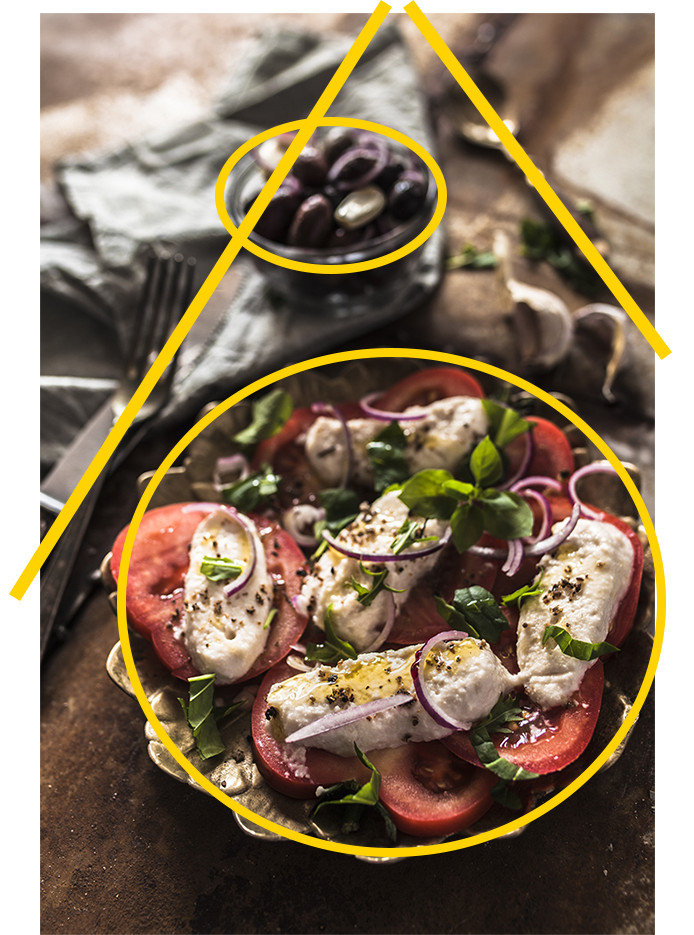
If you extend the lines of the cutlery they will cross diagonally and form some sort of rooftop. Combined with the bowl of olives and the dark area in the lower edge of the photo it virtually frames the plate.
The empty space helps to ‘soothe’ the whole composition and basically tells the observer “There’s nothing to see here! Please return your focus back towards the center of the pic”
The props were used sparingly and with the intention to guide the focus towards the food in the background as well as contributing to the rustic look. A wrinkled, grey fabric, old cutlery, a matt and quite unusual looking golden plate. The backdrop has a nice and rusty patina and adds texture to the photo without being obtrusive.

Even a simple, minimalistic scene will get more radiant and interesting if it has several layers added to it and plays with different texture styling-wise. This photo for example has a lot of layers going on. The already nicely textured backdrop is supported by a wrinkly fabric and a beautiful rustic plate. And even the food has several layers with all different kinds of textures. The mozzarella cheese would have looked quite plain and boring, but thanks to the shiny olive oil, fresh herbs and ground pepper it’s an eye-catcher.
In this photo the food is definitely the main focus point – just as it should be. The tomato and mozzarella slices were positioned with care and very rustically styled. Fresh herbs, thin slices of red onion, golden olive oil and ground pepper make it look most delicious. The most striking colours in this photo are the red of the tomatoes and the green herbs. Those two colours are complementary to each other and make each other pop out even more. A very harmonic combination. The rest of the scene is held in dark and gentle earthy tones.
If you want to learn food photography and take better food photos, start analysing photos from others that you love. Let that be from a favourite Instagramer, cookbooks or Pinterest. If you learn to recognize not only THAT a photos is gorgeous but WHY is is you will be able to transfer this to your own photography.
Don’t be afraid of ‘copying’ to learn and develop your own unique style. Observe and study the basic composition and styling rules to improve and grow.
My Food-Photography Equipment
Behind the Shot
Traditional persian food